How can we enable transformation in the financial inclusion of under-served population of India?
How I designed the first financial app targeted towards blue collared workers in India.
Lead UX Designer & Researcher
September 2018 - October 2019
1 PM, 2 Devs, 1 Product designer (me)
Android native app
Project Overview
Almost 79% of Indians don’t have a credit score, the current market size is about 100 million urban skilled workers, and by 2025 credit demand in India is set to rise by $335 billion.
At Hora.AI, we decided to capture this market that has huge credit potential but is drastically underserved. Our vision
as a seed-funding startup was to focus on a product that reflected the user’s behavior by delivering a fast, digital, and seamless loan journey. It became necessary to not
only delve into the user’s mental model but also create channels for user retention for business.
The Impact
MVP Launched in 4 months, and upon constant iteration over 70% users reached loan eligibility phase with a 45% engagement rate.
I designed this app from scratch - all by myself
The product was in the conceptualizing stages when I joined the startup as a founding designer. To deliver the business goals, the product team decided to approach the lean model.
During my tenure there I achieved some key achievements, which I have listed below:
Research. Conducting market analysis, user interviews, and understanding the business objectives.
Ideation. Brainstorming sessions with the team for features, user flows & information architecture.
Design and Prototype. Agile approach to create multiple iterations through wireframing and quick prototyping.
Review and Testing. Stakeholder and team reviews followed by usability testing to validate the designs.
Research & Discovery
Diving into the market landscape to scope trends
The Indian NBFC (Non-Banking Financial Companies) market has been on the rise in the last five years with the growing demand in the market. To realize Hora’s dream of fitting into this large marketplace with a new user segment, it became necessary to tackle several big bets that had never been undertaken before.
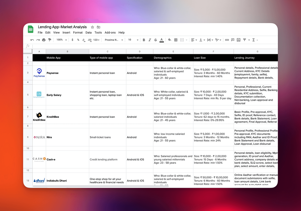
The product manager and I completed a thorough analysis of other lending and financial mobile apps to evaluate their target markets, loan size, user experience, and business standing. This provided us clarity on “what works” and “what does not work” with our vision. This provided us with two key principles to develop the product: “Communication” and “Transparency” so that we could deliver an informative and desirable product for our users.Doing that, gave me an insight into their app’s IA and user flows and helped me identify the pain points as a user.
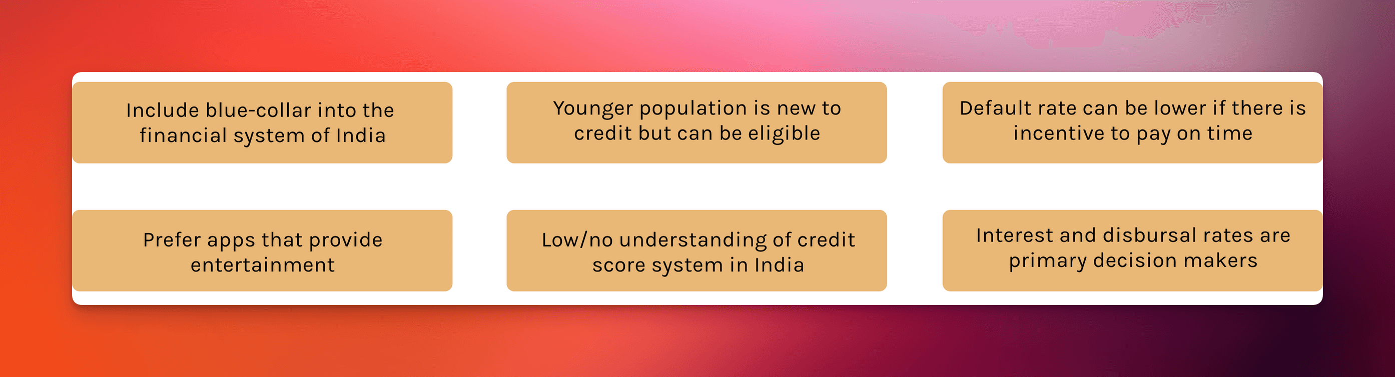
Understanding user behaviours in depth to predict areas of expansion
Right from the get-go, we understood that the product would have to thrive in complex environments. The user groups that we wanted to attract ranged from rejected users to loan-seekers and loan virgins which was a challenge that we had to solve with a single loan journey for all. Along with diverse user groups, it was necessary to acknowledge that the users are not very
tech-savvy and use an android mobile phone with low battery and performance issues.
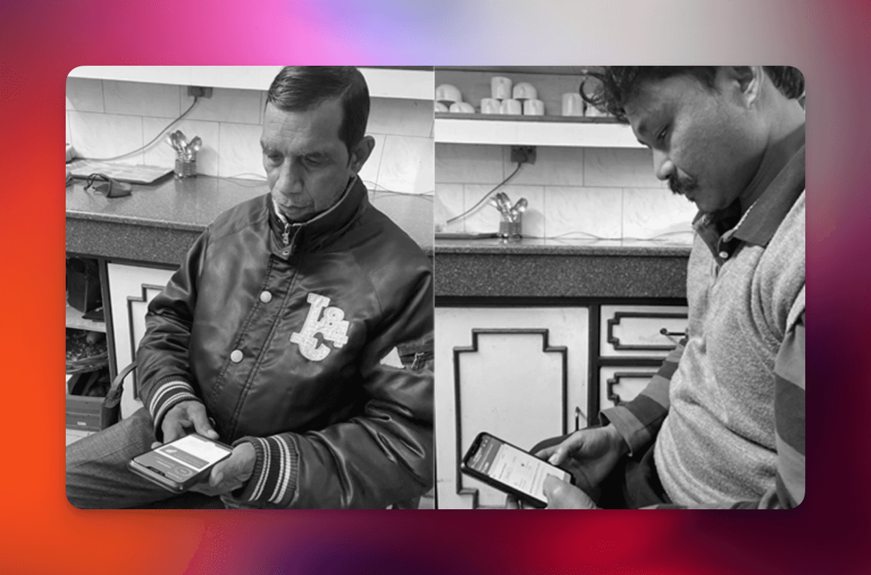
We conducted several interviews with skilled blue-collar workers like carpenters, beauticians, drivers to get better clarity on ways to provide them a good customer experience while retaining them post their loan journey.

Compiling insights to explore avenues of product opportunity
Based on the market and user research, we were able to validate the demand of small-sized loans without hassle or a long, traditional process. The target segment was highly under-served despite being credit-worthy.
Ideation
Aligning business and product goals to create the foundation
The team brainstormed different ideas and requirements gathered from our research, business, and credit objectives. Our primary goal was to create a fast and simple loan journey that users can navigate easily. The secondary goal was to facilitate high engagement by educating the users of the app.
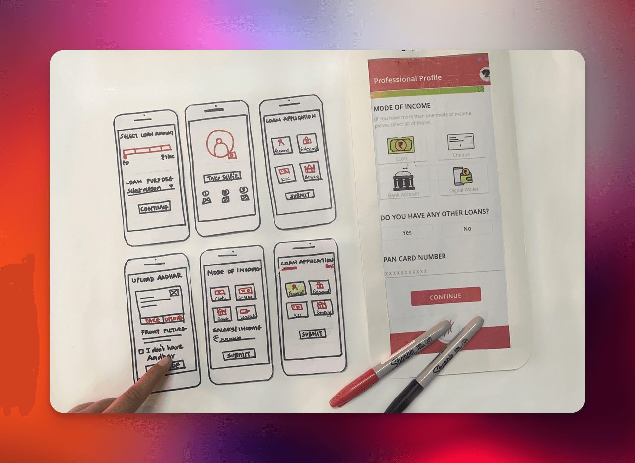
Scoping the challenge to deliver a tangible output.
We wanted to adopt an MVP approach to ideate features. I created paper-functioning prototypes to test internally with the entire team. However, it was difficult for the team to give extensive feedback with paper prototypes as it became difficult for non-designers to assess

Incorporating user feedback and exploring multiple avenues of engagement to refine the product
By creating experimental prototypes and A/B testing with our user, I was able to fine-tune our product capabilities to suit the needs of both the business and the users. With multiple rounds of iterations with all business teams, I created an extensive product flow that became a guide for the developers to create the app structure. The user flows were designed for every feature on the app to communicate within teams.
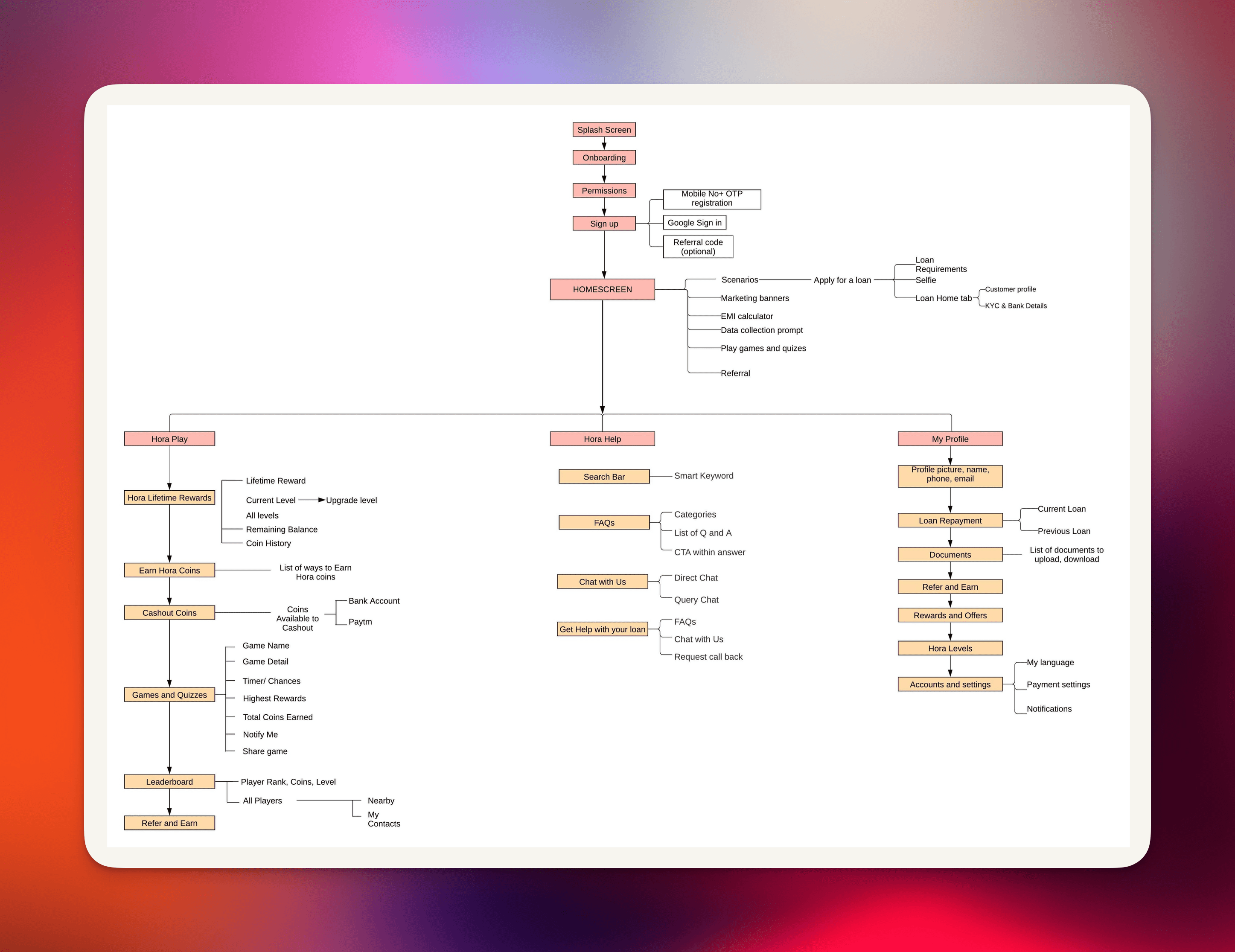
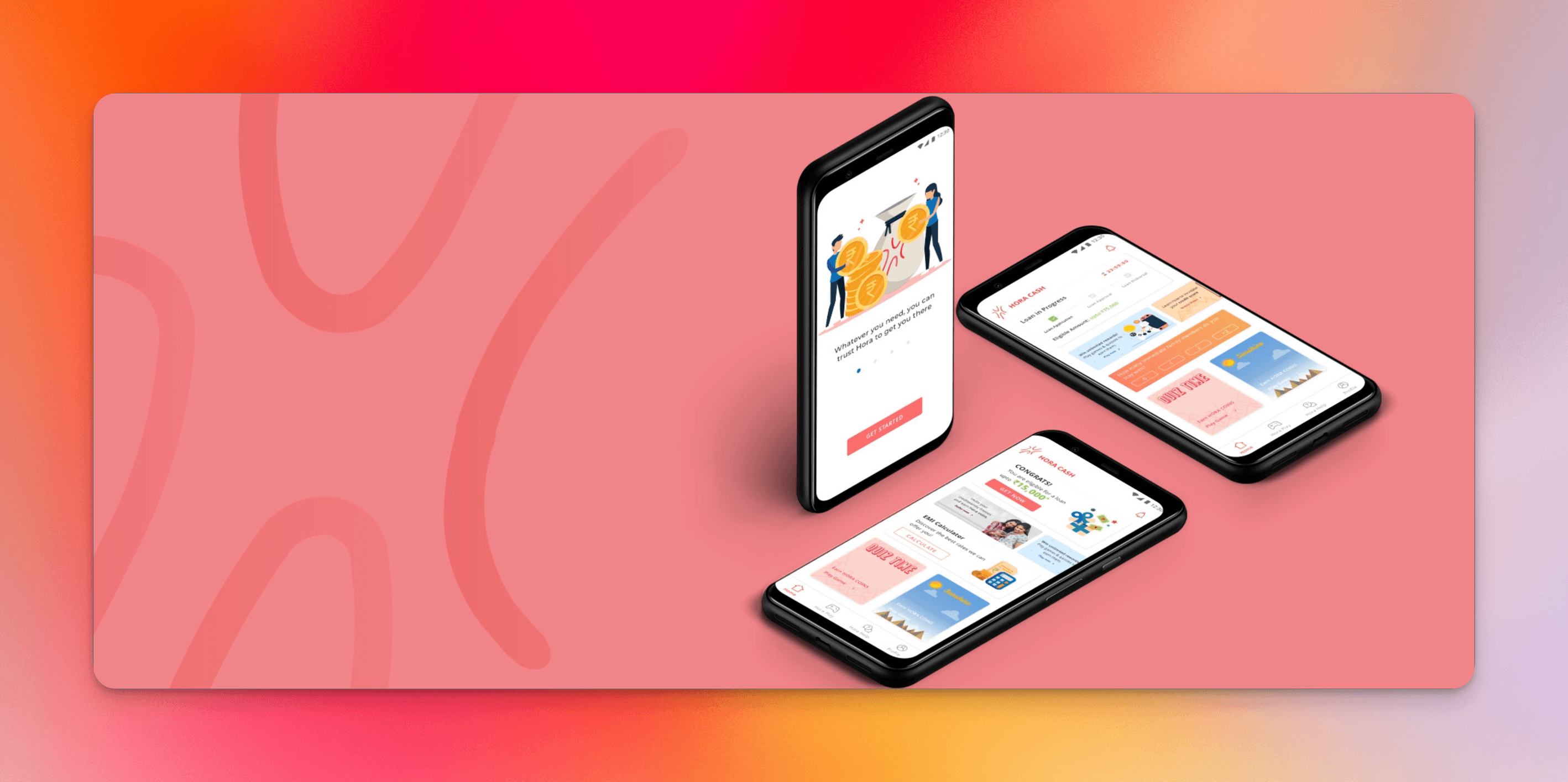
Onboarding
We wanted to engage users by keeping the onboarding and sign-up process concise. I opted for illustrations to show high-level value props rather than in-depth information.
The sign-up includes a Mobile-OTP login making the onboarding experience short and simple.

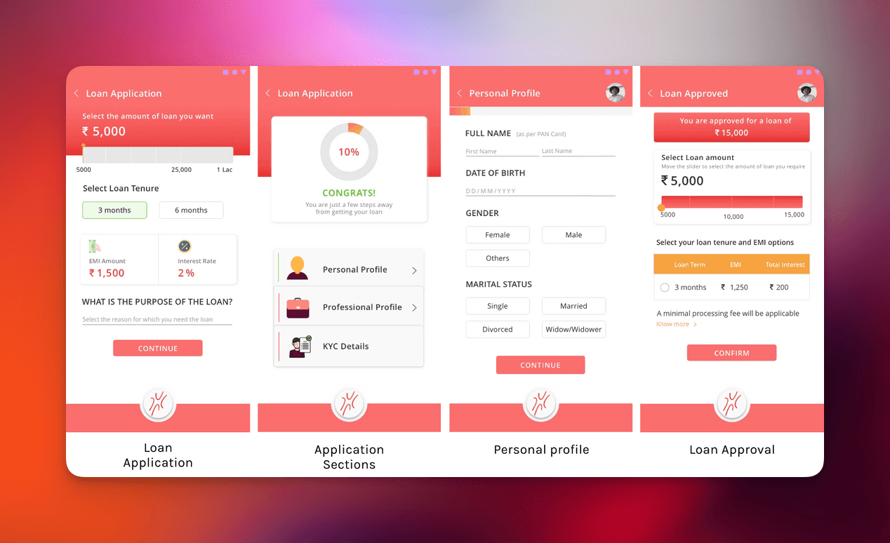
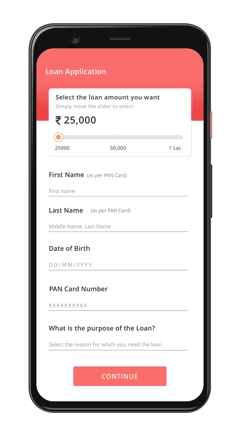
Lending application
The core of the app is the lending application. My objective was to keep the lending journey user-friendly, fast, and dynamic which can be completed in a few minutes. The highlights of the lending application are:
1. The journey is designed to approve or reject the user as soon as possible, to avoid the user from filling the entire application if rejected.
2. Personal documentation is only required once the user is eligible for a loan, maintaining the security of user’s data.
3. The user is guided throughout their loan journey. The app provides their loan journey progress at every stage.
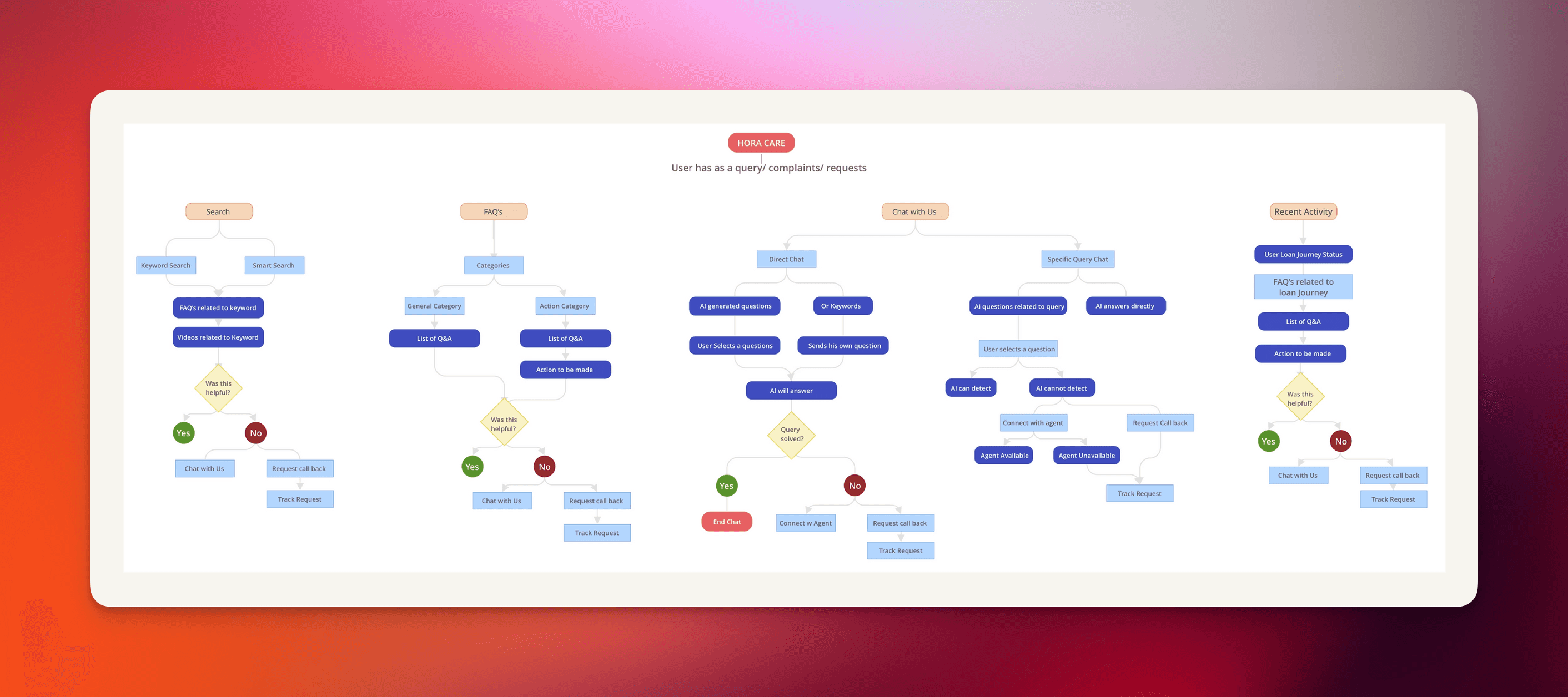
Hora help
Since our users are not adept at using smartphones, we created a customer service that is easily accessible, engaging and highly efficient for the users who are facing issues with their loans. The key features of Hora Help are:
1. Get help with your loan: Customized FAQs for customers who have availed a loan successfully.
2. Chat with us: Live chat with customer service representatives available 24/7.
3. FAQs: A detailed categorized list of FAQs.
4. How to Videos: Short demo videos explaining key processes in the lending application journey.

Hora play
Entertainment plays a huge role in our target segment. We decided to test our waters by introducing educational games and rewards in a loan-lending app that helps working-class users improve their skills. The key features of Hora Play are:
1. Lifetime Rewards: Users can earn rewards that can be used for cash out after a limit. This motivates the user to play as incentivized games are popular.
2. Refer and Earn: Users can refer their potentially credit-worthy friends. This not only helps the company acquire quality user but also creates awareness in the community.
3. Quizzes and Games: Skill enhancing games are valuable for a working-class user applying for a loan.
4. Leaderboard: Leaderboards play a huge role in increasing engagement and motivating the user.

Results
MVP launched in 4 months, enabling the development team to begin backend integration earlier than planned.
Loan applicants progressed to approval steps in under 4 minutes, a 35% reduction in completion time compared to legacy workflows.
Over 70% of users reached loan eligibility phase before needing to upload documents, reducing frustration and drop-offs.
Hora Play features (quizzes & rewards) saw a 45% engagement rate, increasing user retention in a typically low-stickiness segment.
Key takeaways
Cross-functional collaboration empowered innovation: Daily sync-ups with PM, engineers, and business stakeholders led to faster iterations and richer design ideas.
Design thinking under pressure: Lean research methods—such as rapid empathy mapping and paper prototyping—allowed us to generate, test, and refine solutions even without full traditional testing capabilities.
Agile and Lean complement each other: While agile sprints advanced development speed, lean experimentation ensured UX alignment; though the process generated many discarded screens, it sharpened the final experience.
User-centric simplification matters: Structuring the lending flow to screen users early and delaying document uploads improved task speed and reduced cognitive load.
Gamification drove engagement: Introducing educational games and reward systems transformed the app into a habit-forming experience, critical for financial inclusion among first-time credit users.