Raindrop: Redesigning pension forms for 82% conversion
How I transformed a broken form experience that was losing 88% of users into an intuitive flow that dramatically improved business outcomes

Lead UX Designer & Researcher
6 weeks
1 PM, 2 Dev Lead, 1 UX Designer (me), 1 QA
Web (mobile-first)
Project Overview
The Challenge: Raindrop's pension combination form had a devastating 12% completion rate, creating a massive bottleneck in their user acquisition funnel.
My Solution: I redesigned the entire form experience using progressive disclosure, clear progress indicators, and mobile-first design principles.
The Impact
Conversion jumped from 12% to 82%, with valid pension entries rising from 38% to 75%.
The Business Problem
Raindrop helps people reconnect with lost pensions—a valuable service in a market where millions of pounds sit unclaimed. But their core user flow was fundamentally broken.
The situation I inherited:
Only 12% of users completed the pension combination form
88% of potential customers were abandoning the process
The broken funnel was directly impacting revenue and customer acquisition
Internal teams were frustrated by constant user complaints
Why this mattered to the business: Each form completion represents potential pension value recovery for users and revenue for Raindrop. With 88% of users dropping off, the company was essentially losing 9 out of 10 potential customers due to poor UX.
Research & Discovery
I approached this systematically, using multiple research methods to understand exactly where and why users were failing.
User Behavior Analysis
Method: Analyzed 20 Hotjar session recordings (split evenly between desktop and mobile users)
Key Discoveries:
67% abandoned within 30 seconds of seeing the form - users took one look and immediately hit back
Mobile users showed 3x more rage clicking especially on the date picker component
Users repeatedly scrolled up and down looking for progress indicators or form length information
Common pattern: Users would start filling fields, then stop and navigate away when they realised how long the form was
"I watched user after user start typing their details, then suddenly stop and leave the page. It was like they hit an invisible wall."

Operations Team Insights
Method: Interviewed 3 operations team members who handle user support calls
What I learned:
"Users call us confused about why they need National Insurance numbers" - expectation mismatch from ads
"Most invalid submissions happen on mobile devices" - technical usability issues
"People get frustrated when they can't save progress" - no recovery mechanism
Backend data showed 40% of submissions contained formatting errors, mostly from mobile users
Competitive Analysis
Method: Analyzed form experiences across 8 pension and insurance websites
Patterns from best-in-class forms:
Government pension sites consistently used step-by-step flows with clear progress indicators
Insurance forms averaged 3-4 minutes completion time vs our 8+ minutes
Top-performing forms showed estimated time to complete upfront
Most successful forms had save and return functionality

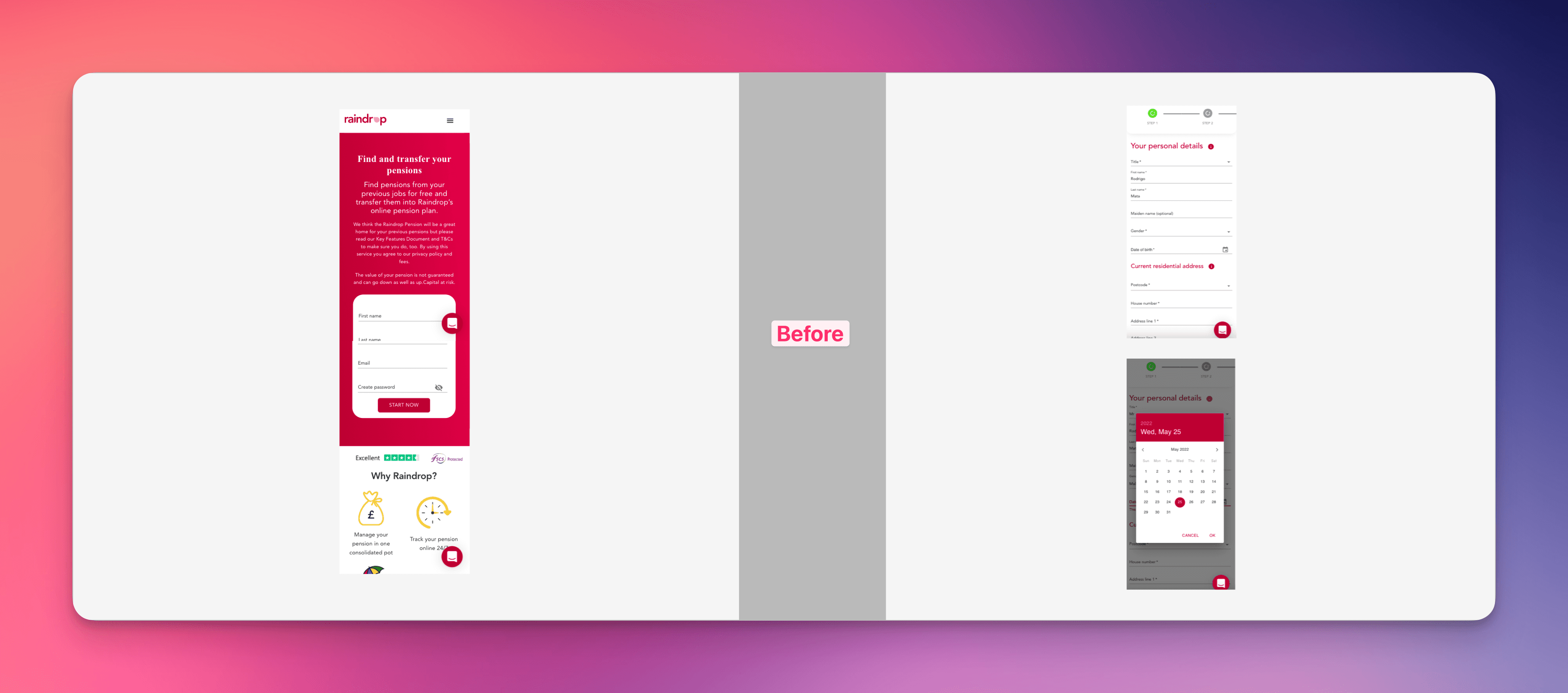
Technical Audit
Method: I completed the form myself across 3 devices and documented every friction point
Critical Issues Discovered:
Mobile date picker was nearly unusable - required precise tapping on tiny elements
No input validation - users only discovered errors after attempting to submit
Form fields not optimized for mobile keyboards (numeric inputs still showed full keyboard)
No clear visual hierarchy - all fields looked equally important
Ideation & Solution Development
I explored multiple approaches to solve these interconnected problems:
Approach 1: Chunked Multi-Step Flow
Concept: Break the form into 3-4 distinct steps with progress indicators
✅ Pro: Reduces cognitive load and provides clear progress
❌ Con: Might feel longer to complete, potential drop-off between steps
Approach 2: Single-Page Optimized Form
Concept: Keep current structure but improve mobile usability and visual design
✅ Pro: Maintains familiar flow, easier to implement
❌ Con: Doesn't address fundamental overwhelm issue
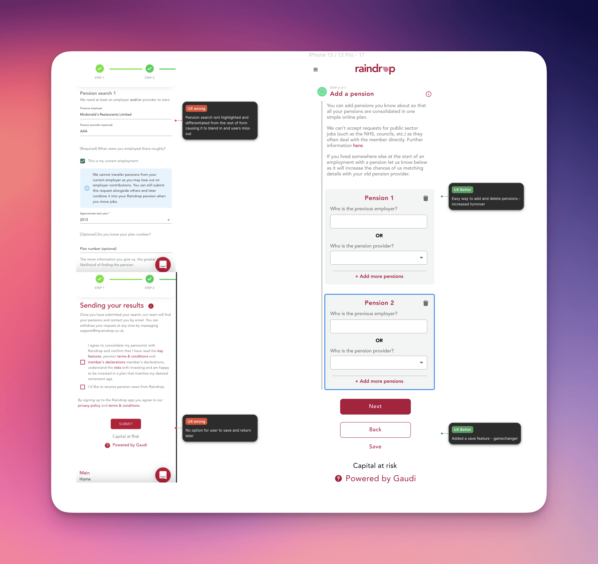
Approach 3: Progressive Disclosure with Save Functionality
Concept: Smart form that reveals fields progressively with automatic saving
✅ Pro: Addresses completion anxiety, mobile issues, and expectation management
❌ Con: More complex to implement, requires backend changes
Why I chose Progressive Disclosure: My research revealed that users feared losing progress more than taking extra steps. The Hotjar sessions showed users frequently scrolling to assess form length before starting. Progressive disclosure would eliminate this anxiety while improving mobile usability.
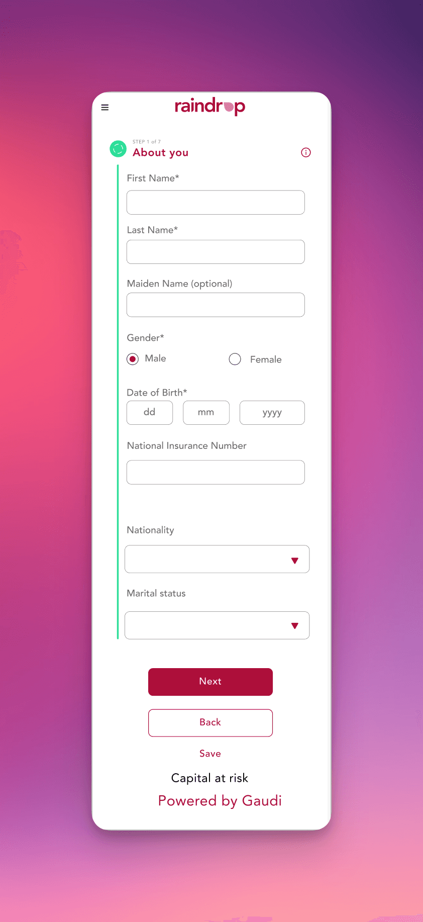
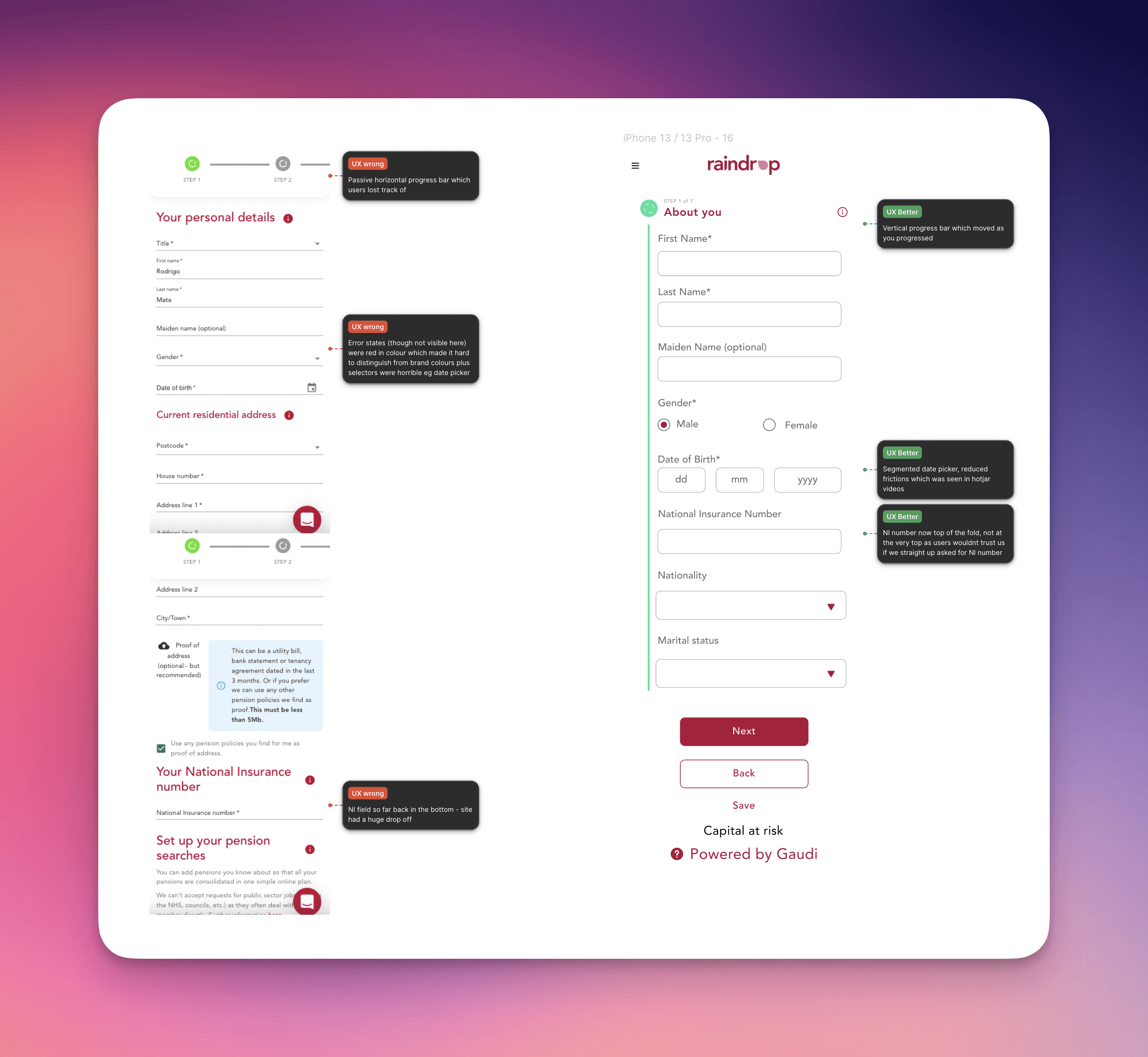
Key Design Decisions
Smart Progressive Disclosure: Form reveals 2-3 fields at a time, creating momentum while reducing cognitive load.
Clear Progress Communication: Prominent progress bar with percentage completion and estimated time remaining.
Auto-Save & Recovery: Automatic progress saving with "Continue Later" option and email reminder functionality.
Mobile-Optimized Inputs: Appropriate keyboard types, real-time validation, and improved date picker with larger touch targets.
Expectation Management: Clear upfront messaging about time required and information needed before starting.
Testing & Validation
Usability Testing
Method: 5 moderated sessions with existing users who had previously abandoned the form
Key Findings:
"The progress bar made me feel like I was actually getting somewhere" - User feedback
100% of test users completed the form vs 12% with original design
Average completion time dropped from 8+ minutes to 4.5 minutes
A/B Testing
Method: Split test with 100 users over 2 weeks (50 original, 50 new design)
Success Metrics: Completion rate, valid submission rate, time to completion
Results:
Completion rate: 12% → 82% (583% improvement)
Valid submissions: 38% → 75% (97% improvement)
Average completion time: 8.2 minutes → 4.5 minutes (45% faster)
Error rate: 40% → 8% (80% reduction)
Post-Launch Monitoring
Method: Monitored analytics and user feedback for 4 weeks post-launch
Sustained Results:
Conversion rate stabilized at 78-82% range
Customer support calls about form issues dropped by 65%
Mobile completion rate matched desktop for first time
Results & Business Impact
Converted 583% more users – Progressive disclosure and mobile optimization transformed 12% completion rate to 82%, directly improving revenue acquisition.
Reduced support overhead – 65% fewer form-related support calls through clearer UX and auto-save functionality, freeing ops team for higher-value work.
Improved data quality – Error rate dropped 80% (40% to 8%) through real-time validation and mobile-first inputs, enhancing downstream operations.
Faster user completion – Average form time reduced 45% (8.2 to 4.5 minutes) while maintaining higher accuracy and user satisfaction.